Multidimensional, social sentiment lexicons
- Overview
- Experience Project confessions
- Data and code
- Extracting subframes
- Basic word-level data
- Basic lexicon generation
- Bringing in the contextual features
- Case study: Age and drunk
- Context-sensitive lexicons
Sentiment analysis courses generally begin with techniques for classifying bits of text as either positive or negative. This is, of course, an important distinction, and useful for lots of applications, but I worry that it doesn't do justice to the blended, multidimensional nature of sentiment expression in language. It also tends to miss its social aspects.
In this first lecture, I hope to set a multidimensional, social tone, by looking at word-level data with complex, nuanced sentiment labels that are inherently relational. Our immediate goal will be to derive context-dependent lexicons from them. It's my hope that this provides insight into sentiment expression and sentiment analysis, and also that the lexicons prove useful later in the week.
If you haven't already, get set up with the course data and code.
The Experience Project is a social networking website that allows users to share stories about their own personal experiences. At the confessions portion of the site, users write typically very emotional stories about themselves, and readers can then choose from among five reaction categories to the story, by clicking on one of the five icons in figure fig:ep_cats. The categories provide rich new dimensions of sentiment, ones that are generally orthogonal to the positive/negative one that most people study but that nonetheless model important aspects of sentiment expression and social interaction.
Table tab:ep provides example confessions along with the contextual data we have available. (These examples are less shocking/sad than the norm at this site — they are confessions, after all.)
Using the raw texts of the confessions and their associated metadata, I compiled a large table of statistics about individual words in their social context (to the extent that we can recover that context from the site). To load this data into R, move to the directory where you are storing your files for this course (see the Misc menu in R) and then run this command:
- ep = read.csv('ep3-context.csv')
The file is large, so this might take a little while to load. Once it has loaded, enter
- head(ep)
This displays the top six lines of the file, which should look like this:
- Word Category Group Gender Age Count Total
- 1 abandoned hugs sex male 2 1 25999
- 2 abandoned rock funny female 2 0 3141
- 3 abandoned understand offtopic female 1 3 42736
- 4 abandoned hugs family female 2 6 28671
- 5 abandoned teehee other unknown unknown 5 71067
- 6 abandoned understand other female 1 2 10915
Here's a rundown of the column values:
- Word gives the whole vocabulary, which contains 7,448 word types. (Run nlevels(ep$Word) to see this.) All are things that were tagged as adjectives by an automatic part-of-speech tagger.
- levels(ep$Word)
- [1] "abandoned" "abbreviated" "abdominal" "aberrant"
- [5] "abhorred" "abhorrent" "abit" "abject"
- [9] "able" "abnormal" "abominable" "aboriginal"
- [13] "aborted" "above" "abrasive" "abridged"
- ...
- Category gives abbreviated versions of the five reader reaction categories discussed above:
- levels(ep$Category)
- [1] "hugs" "rock" "teehee" "understand" "wow"
- Group is a large and diverse high-level textual classification chosen by authors of confessions. The site provides dozens and dozens of these groups. The data here are derived from a restricted set:
- levels(ep$Group)
- [1] "crime" "embarrassing" "family" "friends"
- [5] "funny" "health" "love" "offtopic"
- [9] "other" "revenge" "school" "sex"
- [13] "venting" "work"
- Gender relates to the gender of confession authors:
- levels(ep$Gender)
- [1] "female" "male" "unknown"
- Age relates to the age of the confession authors:
- levels(ep$Age)
- [1] "1" "2" "3" "4" "5" "unknown"
- Count is the number of Category reactions received by confessions containing Word in Group with an author of Gender and Age.
- Total is the number of Category reactions used by confessions containing any Word in Group with an author of Gender and Age.
The Count and Total values are not token counts, but rather counts of the number of reaction categories chosen by readers at the site. The actual token counts generally provide a more intuitive estimate of the amount of data that we have about specific words in context, so I have put them in a separate file:
- eptok = read.csv('ep3-context-tokencounts.csv')
- head(eptok)
- Word Group Gender Age TokenCount
- 1 abandoned family female 5 2
- 2 abandoned embarrassing female 4 1
- 3 abandoned venting female 5 1
- 4 abandoned offtopic unknown unknown 4
- 5 abandoned love unknown 4 1
- 6 abandoned venting unknown 2 1
I've written a number of functions for working with data.frames like ep and eptok as loaded above. To make those available:
- source('ep.R')
The function epFullFrame allows you to pull out subframes of the larger ep frame based on specific values. Here are some examples of its use:
- pf = epFullFrame(ep, 'cool')
- pf = epFullFrame(ep, 'drunk', ages=1)
- pf = epFullFrame(ep, 'crazy', genders='male')
- pf = epFullFrame(ep, 'crazy', ages=1, genders='male')
- pf = epFullFrame(ep, c('gnarly','wicked'), ages=c(1,2,3))
- head(pf)
- Word Category Group Gender Age Count Total
- 370766 gnarly rock health female 2 0 4604
- 370767 gnarly hugs offtopic male 2 0 7422
- 370768 gnarly hugs health female 2 0 15228
- 370769 gnarly understand venting female 3 0 26740
- 370770 gnarly wow offtopic male 1 0 1315
- 370771 gnarly rock offtopic male 1 0 1339
The first argument is the data.frame we loaded before. The second argument is a word or a vector of words (given as quoted strings inside c()). The other arguments are given by keyword. They can come in any order. All of them can be specific values or vectors of values.
The above frames tend to be very large. You can collapse them down into a single five-line frame with epCollapsedFrame:
- pf = epCollapsedFrame(ep, 'cool')
- pf = epCollapsedFrame(ep, 'drunk', ages=1)
- pf = epCollapsedFrame(ep, 'crazy', genders='male')
- pf = epCollapsedFrame(ep, 'crazy', ages=1, genders='male')
- pf = epCollapsedFrame(ep, c('gnarly','wicked'), ages=c(1,2,3))
- pf
- Word Category Count Total
- 1 gnarly|wicked/teens|20s|30s hugs 14 516196
- 2 gnarly|wicked/teens|20s|30s rock 30 461418
- 3 gnarly|wicked/teens|20s|30s teehee 19 251035
- 4 gnarly|wicked/teens|20s|30s understand 17 562470
- 5 gnarly|wicked/teens|20s|30s wow 15 319949
This function groups all of your contextual variables together under Word and sums all the corresponding Count and Total values relative to Category. We'll make heavy use of this function when visualizing the data.
To start, let's ignore the contextual metadata and just study how the words relate to the Category values. I'll use funny as my running example:
- funny = epCollapsedFrame(ep, 'funny')
- funny
- Word Category Count Total
- 1 funny hugs 1730 2357657
- 2 funny rock 1664 1933477
- 3 funny teehee 1633 1101917
- 4 funny understand 2284 2708855
- 5 funny wow 1324 1711879
The Count value shows the number of times that stories containing funny received Category reactions. R makes it very easy to plot these two variables with respect to each other:
- plot(funny$Category, funny$Count, xlab='Category', ylab='Count', main='funny')
This is disappointing! The dominant category appears to be I understand, a sympathetic category. The runner-up is Sorry, hugs, another sympathetic category. This doesn't seem right; if I have occasion to use funny in a story, chances are it is an amusing story. Why isn't Teehee the most likely category?
The problem is immediately apparent if we plot the Total values, which give the overall usage of each of the five categories:
- plot(funny$Category, funny$Total, xlab='Category', ylab='Total', main='All of EP')
Here, we see that the two sympathetic categories that dominated above are also over-represented here. This is explicable in terms of the dynamics of the site: people mostly write painful, heart-wrenching confessions, and the community is a sympathetic one. This is a nice little find, but we need to push past it if we are going to get at the lexical meanings involved, since it looks like even funny just returns the EP-wide ranking of categories.
To abstract away from category size, we divide the Count values by the Total values to get the relative frequency of clicks:
- funny$Count / funny$Total
- [1] 0.0007337793 0.0008606257 0.0014819628 0.0008431607
- [5] 0.0007734191
The epCollapsedFrame function will add these values automatically with the flag freqs=TRUE:
- funny = epCollapsedFrame(ep, 'funny', freqs=TRUE)
- funny
- Word Category Count Total Freq
- 1 funny hugs 1730 2357657 0.0007337793
- 2 funny rock 1664 1933477 0.0008606257
- 3 funny teehee 1633 1101917 0.0014819628
- 4 funny understand 2284 2708855 0.0008431607
- 5 funny wow 1324 1711879 0.0007734191
Plotting Category by Freq gives very intuitive results for funny, because we have overcome the influence of the underlying Category-size imbalances:
- plot(funny$Category, funny$Freq, xlab='Category', ylab='Count/Total', main='funny')
The Freq values can be thought of as conditional distributions of the form P(word|category), i.e., the probability of a speaker using word given that the reaction is category. These values are naturally very small (there are a lot of words to choose from). We can make them more intuitive by calculating a distribution P(category|word), i.e., the probability of category given that the speaker used word. This is a very natural perspective given the reaction-oriented nature of the metadata. The calculation is as follows:
- funny$Freq / sum(funny$Freq)
- 0.1563579 0.1833870 0.3157851 0.1796655 0.1648046
This is equivalent to an application of Bayes' Rule under the assumption of a uniform prior distribution P(category). (Without that uniformity assumption, we will reintroduce the Category bias that we are trying to avoid.)
The epCollapsedFrame function will add these values automatically with the flag probs=TRUE:
- funny = epCollapsedFrame(ep, 'funny', freqs=TRUE, probs=TRUE)
- funny
- Word Category Count Total Freq Pr
- 1 funny hugs 1730 2357657 0.0007337793 0.1563579
- 2 funny rock 1664 1933477 0.0008606257 0.1833870
- 3 funny teehee 1633 1101917 0.0014819628 0.3157851
- 4 funny understand 2284 2708855 0.0008431607 0.1796655
- 5 funny wow 1324 1711879 0.0007734191 0.1648046
Plotting the Pr values gives a distribution that is a simple rescaling of the previous one based on Freq, but the numbers are more intuitive:
- par(mfrow=c(1,2))
- plot(funny$Category, funny$Freq, xlab='Category', ylab='Count/Total', main='funny')
- plot(funny$Category, funny$Pr, xlab='Category',
ylab='(Count/Total) / sum(Count/Total)', main='funny')
The plots so far are relatively utilitarian. I've included in ep.R a function epPlot that yields a lot more information in a way that I hope is more perspicuous:
- par(mfrow=c(1,2))
- epPlot(ep, eptok, 'funny')
- epPlot(ep, eptok, 'funny', probs=TRUE)
These plots include confidence intervals derived from the binomial. When probs=TRUE, they also give an informal null-hypothesis line at 1/5 = 0.20. As a first approximation, we might conjecture that any category with its confidence interval fully above 0.20 is over-represented and any with its confidence interval fully below 0.20 is under-represented. I think an even better way to get at this is to calculate observed/expected values for each category. These can be added to collapsed frames as follows:
- funny = epCollapsedFrame(ep, 'funny', freqs=TRUE, probs=TRUE, oe=TRUE)
- Word Category Count Total Freq Pr observed expected oe
- 1 funny hugs 1730 2357657 0.0007337793 0.1563579 1730 2074.1637 -0.16592889
- 2 funny rock 1664 1933477 0.0008606257 0.1833870 1664 1701.2042 -0.02186935
- 3 funny teehee 1633 1101917 0.0014819628 0.3157851 1633 970.1432 0.68325661
- 4 funny understand 2284 2708855 0.0008431607 0.1796655 2284 2383.3928 -0.04170224
- 5 funny wow 1324 1711879 0.0007734191 0.1648046 1324 1506.0960 -0.12090600
The observed values just repeat Count. The expected values are derived by multiplying the word's overall token count by the probability of each category:
- category.probs = (funny$Total/sum(funny$Total))
- funny.count = sum(funny$Count)
- funny.expected = funny.count * category.probs
- funny.expected
- [1] 2074.466 1701.237 969.560 2383.480 1506.256
The oe value is then the result of dividing observed by expected and subtracting 1 from the result:
- (funny$observed / funny.expected) - 1
- [1] -0.16605064 -0.02188818 0.68426917 -0.04173740 -0.12099951
Where O/E is above 0 for a category C, the word is over-represented for C. Where O/E is under 1 for C, the word is under-represented for C.
You can plot these values directly with epPlot:
- epPlot(ep, eptok, 'funny', oe=TRUE)
These plots also display statistics from the G-test. The G-test closely resembles the chi-squared test, except that it is done in log space. The test essentially compares the observed and expected values. The p value assesses the probability of the observed counts given that they are drawn from a multinomial distribution given by the expected counts. It provides some initial insight into whether we should draw any conclusions from the observed distribution. I emphasize that this is merely an initial insight. Our counts are so large that nearly every distribution is unlikely given the logic of the G-test, and we will be running lots of such tests, so its value is really in showing where have insufficient evidence. That is, where p is large, we probably can't draw conclusions. Where p is small, we have a promising clue, but we'll want to do more work.
Exercise ep:ex:plot
Pick a coherent set of adjectives and use epPlot to get a feel for what the data are like and how the derived values behave. If you want to see all of them at once, use
- par(mfrow=c(2,2)) ## for where you want a 2 x 2 plotting window
and then call epPlot repeatedly.
Exercise ep:ex:catassoc
For each category, try to find some words that strongly associate with that category, in the way we saw that funny associates with Teehee.
I now offer a simple method for generating a multidimensional lexicon using the above techniques:
First, we define an auxiliary function that, when given a subframe based on a specific Word value w, runs the G-test on the collapsed frame for w and returns the vector of O/E values along with the p value and the overall token count:
- ## You can paste this directly into your R buffer to make it available:
- epLexicon = function(pf) {
- pf = epCollapsedFrame(pf, pf$Word[1], freq=TRUE, oe=T)
- fit = epGTest(pf)
- return(c(pf$oe, fit$p.value, sum(pf$Count)))
- }
The plyr library allows us to apply epLexicon to the entire ep data.frame:
- ## Load the needed library:
- library(plyr)
- ## This step takes a while:
- eplex = ddply(ep, .variables=c('Word'), .fun=epLexicon, .progress='text')
- ## Add intuitive column names:
- colnames(eplex) = c('Word', levels(ep$Category), 'p.value', 'Tokencount')
- ## Check out the results:
- head(eplex)
Now we have some options. We can filter on p.value and/or Tokencount values, reduce negative values to 0, and so forth. Here's a function for seeing the top associates for a given category:
- epViewAssociates = function(lexdf, category, p=1, count=1) {
- sublex = subset(lexdf, p.value <= p & Tokencount >= count)
- return(sublex[order(sublex[, category], decreasing=TRUE), ])
- }
And a pretty restrictive call to it:
- head(epViewAssociates(eplex, 'hugs', p=0.001, count=50))
- Word hugs rock teehee understand wow p.value Tokencount
- 591 bittersweet 1.450935 -0.7122943 -0.07182327 -0.3886007 -0.5207253 0.000000e+00 987
- 82 adoptive 1.434472 -0.5396253 -0.48102157 -0.2106924 -0.6161864 4.600848e-06 55
- 668 bothersome 1.416726 -0.9134441 -0.83308446 0.4620579 -0.6227922 1.873651e-09 53
- 1392 danny 1.301143 -0.2690592 -0.53930258 -0.5039832 -0.1307639 4.625697e-08 98
- 6559 unbiased 1.296421 -0.4620813 -0.05717857 -0.3076902 -0.7185333 6.594959e-06 58
- 5587 sickly 1.197354 -0.4893234 -0.43696065 -0.1369859 -0.4553989 5.935578e-06 79
You might want to save your lexicon in a CSV file so that you can read it in later:
- write.csv(eplex, 'ep3-basic-lexicon.csv', row.names=F)
Exercise ep:ex:lex
If you were able to generate the lexicon, use the above functions to study it.
Exercise ep:ex:lexprob
What shortcomings is a lexicon like this likely to have, and how might we address those shortcomings?
So far, we have ignored all the cool contextual features included in the ep data.frame. It's now time to bring them in, to create a more social, context-aware lexicon.
As a first pass towards understanding the connections, we do a bunch of epPlot calls for different values of the metadata we care about:
- par(mfrow=c(1,3))
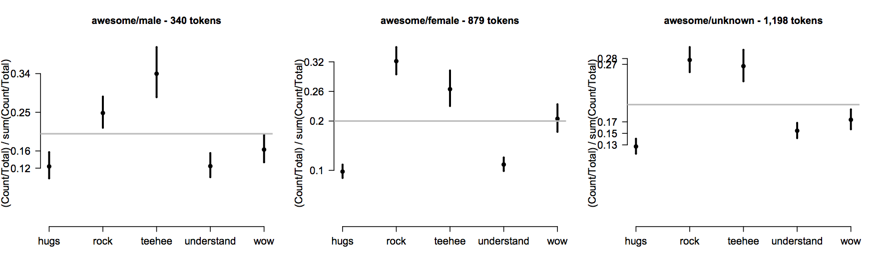
- epPlot(ep, eptok, 'awesome', genders='male', probs=T)
- epPlot(ep, eptok, 'awesome', genders='female', probs=T)
- epPlot(ep, eptok, 'awesome', genders='unknown', probs=T)
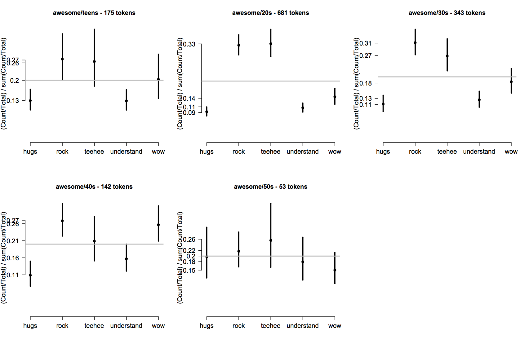
Or, for Age, excluding the unknown category:
- par(mfrow=c(2,3))
- for (i in 1:5) { epPlot(ep, eptok, 'awesome', ages=i, probs=T) }
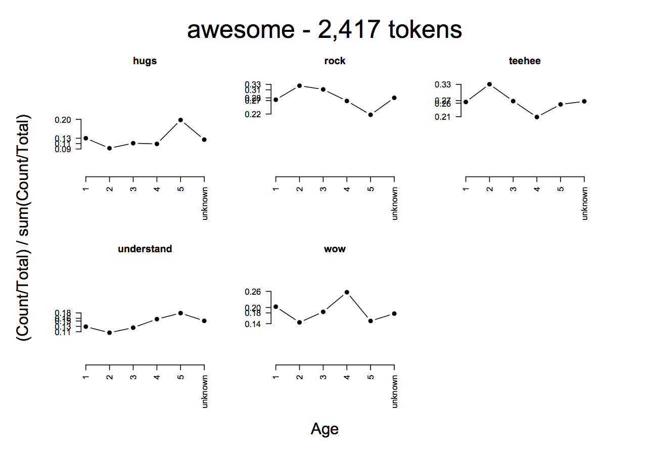
I don't find these especially easy to parse. It's easy to see that the distributions differ, but fine-grained analysis of how they differ is hard. I think ep.R provides a better method. The function epCategoryByFactorPlot lets you visualize, for a given word, how the Category variables relate to a supplied piece of context data. For example:
- ## By gender:
- epCategoryByFactorPlot(ep, eptok, 'awesome', 'Gender', probs=T, type='b')
- ## Connect the lines with type='b' to see trends more easily:
- epCategoryByFactorPlot(ep, eptok, 'awesome', 'Age', probs=T, type='b')
Exercise ep:ex:contexthighlight
For each of the context variables we have (Age, Gender, Group), try to find words that highlight how these variables are important.
Exercise ep:ex:agerel
Survey designers sometimes think of age as being quadratic in the sense that the very old and the very young pattern together for a variety of issues. Are there any words that manifest this parabolic pattern?
Exercise ep:ex:unk
Each category has a sizable 'unknown' population, because users at the site are not required to supply these data points. Can we venture any tentative inferences about what this unknown population is like by studying the usage patterns?
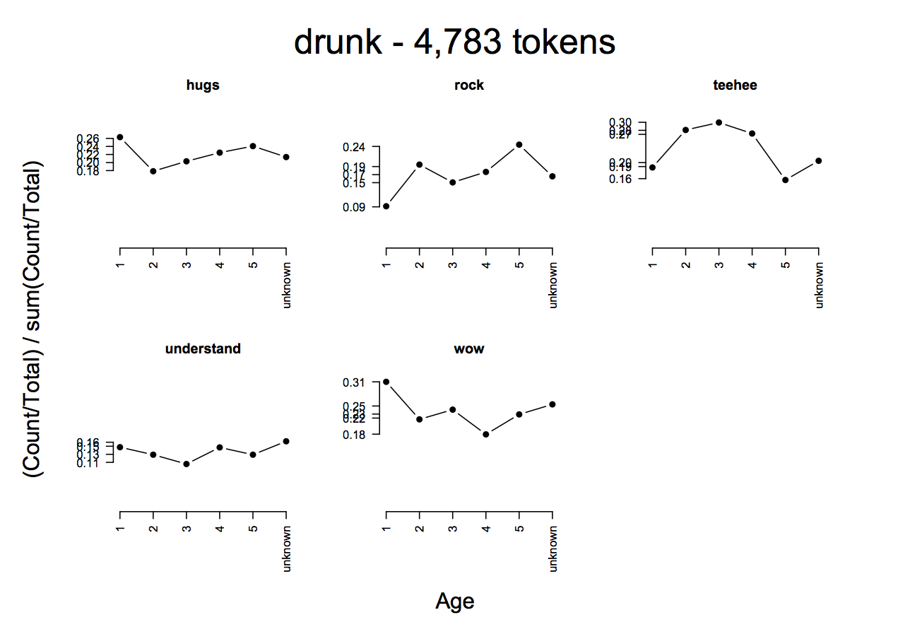
The following plot suggests that stories containing drunk are importantly influenced by the age of the author:
- epCategoryByFactorPlot(ep, eptok, 'drunk', 'Age', probs=T, type='b')
I propose two regression-based methods for understanding these relationships more deeply. To start, let's fit a simple generalized linear model (GLM) that uses both Category and Age to predict the log-frequency of drunk:
- ## Get the frame:
- drunk = epFullFrame(ep, 'drunk', age=c(1,2,3,4,5))
- ## Ensure that Age is numeric:
- drunk $Age = as.numeric(drunk $Age)
- ## Fit the model:
- fit.glm = glm(cbind(Count,Total-Count) ~ Category - 1 + Age, data=drunk, family=binomial)
- summary(fit.glm)
- ## I abbreviate the output of summary to avoid distractions:
- ...
- Coefficients:
- Estimate Std. Error z value Pr(>|z|)
- Categoryhugs -6.72485 0.04789 -140.414 < 2e-16 ***
- Categoryrock -6.82601 0.05615 -121.570 < 2e-16 ***
- Categoryteehee -6.38640 0.05720 -111.659 < 2e-16 ***
- Categoryunderstand -7.18148 0.05260 -136.534 < 2e-16 ***
- Categorywow -6.61393 0.05758 -114.859 < 2e-16 ***
- Age -0.08736 0.01477 -5.913 3.35e-09 ***
- ---
- Signif. codes: 0 ‘***’ 0.001 ‘**’ 0.01 ‘*’ 0.05 ‘.’ 0.1 ‘ ’ 1
- ...
In this model, I subtracted 1 from the Category coefficient, which corresponds to removing the Intercept term. Without this, R would pick one of the Category values (probably hugs, since it is alphabetically first) as a reference category, which would make the model hard to interpret.
Now, the above model is hard to interpret anyway, but we can make it more intuitive by thinking of it as a function that predicts frequency based on which category we're in and what age our author is:
- ## Calculate fitted values.
- ## fit: fitted model of the form P(word) ~ Category - 1 + Age
- ## category: one of the reaction categories
- ## age: an integer
- FittedGlmFunc = function(fit, category, age) {
- ## Extract the coefficients:
- coefs = fit$coef
- ## Get the category coefficient:
- cat.coef = coefs[[paste('Category',category, sep='')]]
- ## Get the fitted value; plogis is the inverse logit function,
- ## which maps the weights from the regression to frequencies:
- prediction = plogis(cat.coef + coefs[['Age']]*age)
- return(prediction)
- }
A few examples:
- FittedGlmFunc(fit.glm, 'wow', 1)
- [1] 0.001227812
- FittedGlmFunc(fit.glm, 'wow', 2)
- [1] 0.001125213
- FittedGlmFunc(fit.glm, 'rock', 2)
- [1] 0.0009103791
- FittedGlmFunc(fit.glm, 'rock', 5)
- [1] 0.0007006292
The following plot systematically compares the fitted values with the empirical ones, using epPlot:
- par(mfrow=c(2,3))
- cats = levels(ep$Category)
- for(i in 1:5) {
- epPlot(ep, eptok, 'drunk', age=i)
- for (j in 1:5) {
- val = FittedGlmFunc(fit.glm, cats[j], i)
- points(j, val, col='red', pch=19)
- }
- }
The second method I propose uses a hierarchical logistic regression in which the only fixed-effect predictor is Category and Age is a hierarchical predictor. This is very similar to what we did above, but it should provide better by-Age estimates and it will give us more flexibility when building lexicons.
In brief, a hierarchical regression model is one in which there are two kinds of predictor: fixed-effects terms, which are analagous to the predictors from our GLM above, and hierarchical terms, which group the data into subsets. The coefficient values are fit via an iterative process that goes back and forth between the fixed effects and the hierarchical ones, continually reestimating the values until they stabilize. In practical terms, this tends to give better estimates for subgroups for which we have relatively little data, because those subgroup estimates benefit from those of the full population.
The only down-sides I see are that the models are computationally expensive to fit and we can't treat Age as continuous anymore.
The basic model specification looks very much like the one we use before with glm, except that now we repeat the fixed-effects terms inside parenthesis, before | Age
- ## Load the library for doing hierarchical modeling:
- library(lme4)
- fit.lmer = lmer(cbind(Count,Total-Count) ~ Category - 1 +
(Category - 1 | Age),
data=drunk, family=binomial)
The coefficients are all significant, so let's concentrate on what they say. As before, they are somewhat more intuitive when converted to frequencies:
- plogis(fixef(fit.lmer))
- Categoryhugs Categoryrock Categoryteehee Categoryunderstand Categorywow
- 0.0008895718 0.0006963748 0.0009679585 0.0005483507 0.0009364059
The fixed effects estimates are a kind of weighted average of the hierarchical ones, with larger hierarchical categories contributing more than smaller ones. They can be used where no age information is available.
It's helpful to see these values plotted next to the empirical values:
- epPlot(ep, eptok, 'drunk')
- points(plogis(fixef(fit.lmer)), col='green', pch=19, lwd=5)
Based on this plot, we might say that drunk stories are either especially heart-wrenching or especially funny. Both our empirical estimate and the fitted model agree on this. However, we can see from our earlier breakdown that this isn't an "either/or" choice. Rather, it is conditioned in part by age. The hierarchical estimates bring this out well. To extract them:
- hier = coef(fit.lmer)$Age
- hier
- Categoryhugs Categoryrock Categoryteehee Categoryunderstand Categorywow
- 1 -7.049464 -7.802812 -7.308462 -7.719356 -6.999898
- 2 -6.910581 -6.842171 -6.462696 -7.293635 -6.755380
- 3 -6.793853 -7.078609 -6.375680 -7.324456 -6.595666
- 4 -7.073637 -7.248539 -7.024493 -7.524842 -7.126939
- 5 -7.286526 -7.356749 -7.505571 -7.669464 -7.374190
- ## Let's map them to frequencies too:
- hier = plogis(as.matrix(hier))
- Categoryhugs Categoryrock Categoryteehee Categoryunderstand Categorywow
- 1 0.0008671216 0.0004084175 0.0006693980 0.0004439494 0.0009111442
- 2 0.0009961851 0.0010666443 0.0015581505 0.0006793903 0.0011632426
- 3 0.0011193884 0.0008422345 0.0016995674 0.0006587838 0.0013644127
- 4 0.0008464290 0.0007107076 0.0008890272 0.0005392229 0.0008025299
- 5 0.0006842344 0.0006378633 0.0005497091 0.0004666501 0.0006268412
We can again plot these values and compare them to their empirical estimates:
- par(mfrow=c(2,3))
- for (i in 1:5) {
- epPlot(ep, eptok, 'drunk', age=i)
- points(seq(1,5), plogis(fixef(fit.lmer)), col='green', pch=19, lwd=5)
- points(seq(1,5), hier[i, ], col='red', pch=19, lwd=5)
- }
Exercise ep:adapt
Adapt the above code so that you can run additional case studies. Really, this just involves turning the model fitting steps into a function,
and perhaps writing a few versions of FittedGlmFunc for different contextual variables.
The above case study suggests a general method for building context-sensitive lexicons. Here is the procedure, focussing on sensitivity to author age:
- For each word w in the vocabulary, fit an lmer model for w with Category as the fixed-effects predictor and Age as the hierarchical predictor.
- Optionally filter using the p-values to help avoid giving sentiment scores where there isn't sufficient evidence to support them.
- Use the coefficients from the model as sentiment scores: where age information is available, use the hierarchical estimates, else use the fixed effects estimates.
This is very computationally intensive, as you probably gathered if you waited around for your own lmer models to converge. However, it can be parallelized if necessary, and it need only be done once.
Exercise ex:larger
The small vocabulary of ep3-context.csv might start to feel confining after a little while. The file epconfessions-unigrams.csv in the code distribution for my SALT 20 paper is compatible with the above functions. It doesn't have the contextual features, but it has a truly massive vocabulary: potts-salt20-data-and-code.zip. The distribution doesn't contain a token-counts file, but you can download one here and treat it like eptok above: epconfessions-tokencounts-unigrams.csv.zip.